By: Sabrina Davidson
For this walkthrough, I’m going to go section by section starting from the top and working to the bottom of the site. Also, as a good practice, I would recommend making each of your sections first with just your paragraphs and heading before adding any pictures or other unique features. I think this makes it a little easier to see where all of the text elements are going to go first.
Adding in extras: I used a google supported front. These are free you just need to add in the link for google font in the head section of your code. This is also where your stylesheet will need to go.
I always like to start with the navigation bar.
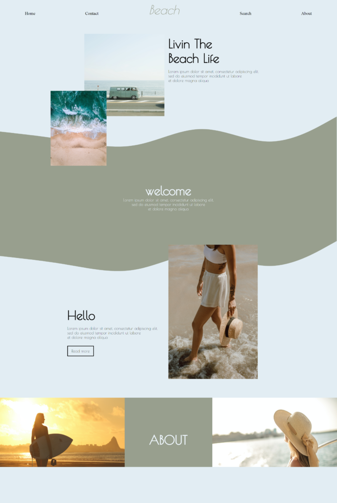
For the navigation bar. I wanted to have it split into two sections broken up by a middle header. To do this I created center-aligned, right-aligned, and left-aligned links. Note that my links are not linked to another page since this is an example. This style of navigation bar is also on W3schools. They have a lot of excellent ways to code for your navigation bar depending on how you want your links to behave.
Starting with the text I just chose to have a h1 header and then a paragraph of text. This was aligned to be in the center of the page but justified so that the header and paragraph are more to the right side of the center.
Adding in the images. I choose 2 beach images. These I wanted to have the corner of the pictures overlap each other. So I added in the pictures and then the CSS for this. The CSS is really what makes the pictures be overlapped. The way I did this by having the attributes be “Float: left; margin-left: 15%” and “Float: left; margin-left: 25%;” This way the images were overlapped at the corner and were position left of the text.
For this section, I wanted to have a wave background. I’ve seen this recently with several websites and thought it would make a great addition to this one since its beach themed. I started with making a section using the section tag this way you can specify how large the section is and code just that area and customize the CSS for that section. This is where the fun comes in for making that wave pattern background. I used a site called getwaves.io. They let you design the type of wave you would like from the pattern to the color and then SVG code it so it’s easy to copy and paste into your code. I added this code to the bottom of my code. I also changed the color to match the next section so that my wave would make the border between the top and “Welcome” section.

The “Welcome” section
Like with the top section I wanted to add some simple text starting with the h1 headers and a paragraph of text. This just center-aligned.
Then I added an image to this section that floated this image to the right. This way it would be aligned more to the right side. I also wanted the top to overlap into the next section as well.
For this section, I also added a wave again at the bottom and changed the color to match that of the background of the section.
In this section I again added more h1 header and
paragraph of text but I also wanted to add in a simple button. I used the button tag with some CSS to make it super easy to get a hover over and clickable button. This also a neat feature so that you can make buttons really quickly. Again my button is not linked in this example.
For both the text and button I alighted everything more to the left so that the image from the above section could be seen.
Lastly, the about section I wanted to make this into almost thirds split between the header ‘about” and 2 pictures. I did this by centering my text and then adding in the images. For one image I used float to align them to the left and the other to the right respectively. This way they were on either side of the text header in the middle. Also to make this section match the section size I resized each picture to fit the correct number of pixels. It’s also really important to note that for overflow since these pictures were somewhat large that on the X plain the overflow is hidden.
A little explanation on this when you look at a website y and x values are coordinates like on a grid. Y is the vertical and X being horizontal in your scroll. So that being said if there are larger images that you want to hide you can have the overflow be hidden so you wouldn’t be able to scroll vertically or horizontally.
I would love to know your thoughts on this beginner-friendly website. I had so much fun coding this example. If you have any designs you would like to see be code leave me a comment or connect with me on my social media.
Thanks for reading Tech Byte with Brina.
W3 Schools: Navigation bar
https://www.w3schools.com/css/css_navbar.asp
YouTube example videos:
How to add wave background:
https://www.youtube.com/watch?v=3owx2vJHkv4
Simple website using HTML and CSS:

Sabrina Davidson, a tech enthusiast and passionate advocate for empowering others through technology, is dedicated to sharing her expertise, insights, and experiences to inspire and guide individuals in navigating the ever-changing digital landscape.